
The Colosseum of Code: An Introduction to Programmatic Trading
Where Charts Meet Code—Your First Battle in the World of Automated Analysis

Previously on Murim trading…

Now back to the present…
Good evening, my pupils. How has your isolation training been? I imagine some of you have broken through new levels, while others have simply broken your accounts.
But that’s the way of the path progress is uneven. Regardless of who’s who, your sensei has returned.
And this time, I’ve brought back something interesting from my travels
Lets us go

On my last journey, I encountered a peculiar sect.
They call themselves quants.
At first glance, they seemed like petty magicians fiddling with machines, staring at charts with code instead of candles. But when I looked deeper, I realized They’re not so different from us.
They are, in fact, an unorthodox sect of the same game.
While most traders battle the markets with gut and grit, quants build systems.
They write programs to analyze markets, spot edges, and sometimes even trade automatically. Now I’m no fully-fledged quantitative trader.
But I know a thing or two about programming, and I can show you the door.
Whether you choose to walk through it is up to you. we’ll step into the Colosseum
Not the one in Rome, but a digital one, called Google Colab.

It’s free, it runs Python code, and it lets you summon the power of data analysis without installing anything. Think of Colab as a cloud dojo for experimentation. A place where you can be all technical and test your theories without worrying emotions and bias
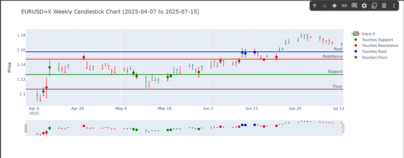
Most of you should already know about support and resistance, tonight, I’m introducing two more concepts:
Floor
The “deep support” price may drop here after breaking support, but often bounces back
Roof
The “high ceiling” above resistance, where price may get exhausted
These extra levels are relative markers think of them like Einstein’s relativity applied to price action. They help us map zones beyond the obvious. Now let us get to the good stuff, pay attention you could get lost in thought and wonder.
Behold the sorcery we’ll use:
import yfinance as yf
import plotly.graph_objects as go

# Define start and end dates
start_date = '2025-04-07'
end_date = '2025-07-15'

# Retrieve EUR/USD weekly data
symbol = "EURUSD=X"
ticker = yf.Ticker(symbol)
data = ticker.history(start=start_date, end=end_date, interval="1d")

# Extract price and date info
x = data.index.strftime('%Y-%m-%d').tolist()
high = data['High'].tolist()
low = data['Low'].tolist()

# Key levels
support = 1.12649
resistance = 1.14743
floor = 1.10655
roof = 1.15746

# Detection function
def detect_levels(dates, highs, lows, support, resistance, floor, roof):
    results = []
    for i in range(len(dates)):
        hi, lo, dt = highs[i], lows[i], dates[i]

        touches_support = lo <= support <= hi
        touches_resistance = lo <= resistance <= hi
        touches_floor = lo <= floor <= hi
        touches_roof = lo <= roof <= hi

        status = []
        if touches_support: status.append('support')
        if touches_resistance: status.append('resistance')
        if touches_floor: status.append('floor')
        if touches_roof: status.append('roof')
        if not status: status.append('none')

        results.append({
            "date": dt,
            "high": hi,
            "low": lo,
            "mid": (hi + lo) / 2,
            "tags": status
        })
    return results

# Analyze candles
results = detect_levels(x, high, low, support, resistance, floor, roof)

# Candlestick chart
fig = go.Figure(data=[go.Candlestick(
    x=data.index,
    open=data['Open'],
    high=data['High'],
    low=data['Low'],
    close=data['Close']
)])

# Add horizontal levels
fig.add_hline(y=support, line_color='green', line_width=2, annotation_text='Support')
fig.add_hline(y=resistance, line_color='red', line_width=2, annotation_text='Resistance')
fig.add_hline(y=floor, line_color='brown', line_width=2, annotation_text='Floor')
fig.add_hline(y=roof, line_color='blue', line_width=2, annotation_text='Roof')

# Define color mapping for markers
tag_colors = {
    'support': 'green',
    'resistance': 'red',
    'roof': 'blue',
    'floor': 'brown'
}

# Add point markers for each level interaction
for tag, color in tag_colors.items():
    tag_points = [r for r in results if tag in r['tags']]
    fig.add_trace(go.Scatter(
        x=[p['date'] for p in tag_points],
        y=[p['mid'] for p in tag_points],
        mode='markers',
        marker=dict(color=color, size=8, symbol='circle'),
        name=f"Touches {tag.capitalize()}",
        text=[f"Date: {p['date']}<br>High: {p['high']}<br>Low: {p['low']}<br>Tag: {tag}" for p in tag_points],
        hoverinfo='text'
    ))

# Layout
fig.update_layout(
    title=f"{symbol} Weekly Candlestick Chart ({start_date} to {end_date})",
    yaxis_title="Price",
    xaxis_rangeslider_visible=True,
    hovermode="closest"
)

fig.show()
Now i sure you’re what the gibberish above is, allow me to explain, that is a script that fetches candlestick data from a site called yfinance, then it takes the given levels and plots an interactive graph, showing you a chart with support, resistance…along with marking candles that touch the levels we provided. Why should you care? Because this is just the beginning, once you can define levels programmatically, detect price behavior automatically, visualize it clearly you’re no longer just trading you’re starting to build emotionless systems, systems can be back-tested, shared, and improved.
Talk is cheap it would be better to just show you
Do yall see what im talking about, im by no means saying that after reading this youre gonna be the next big thing in tech, this was just me showing you guys the methods that are available to you, if you would like to pursue this i recommend going and learning the python programming language fuck around with it a bit see if you like it.
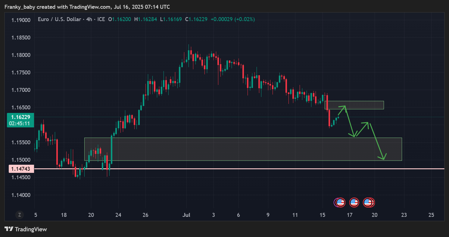
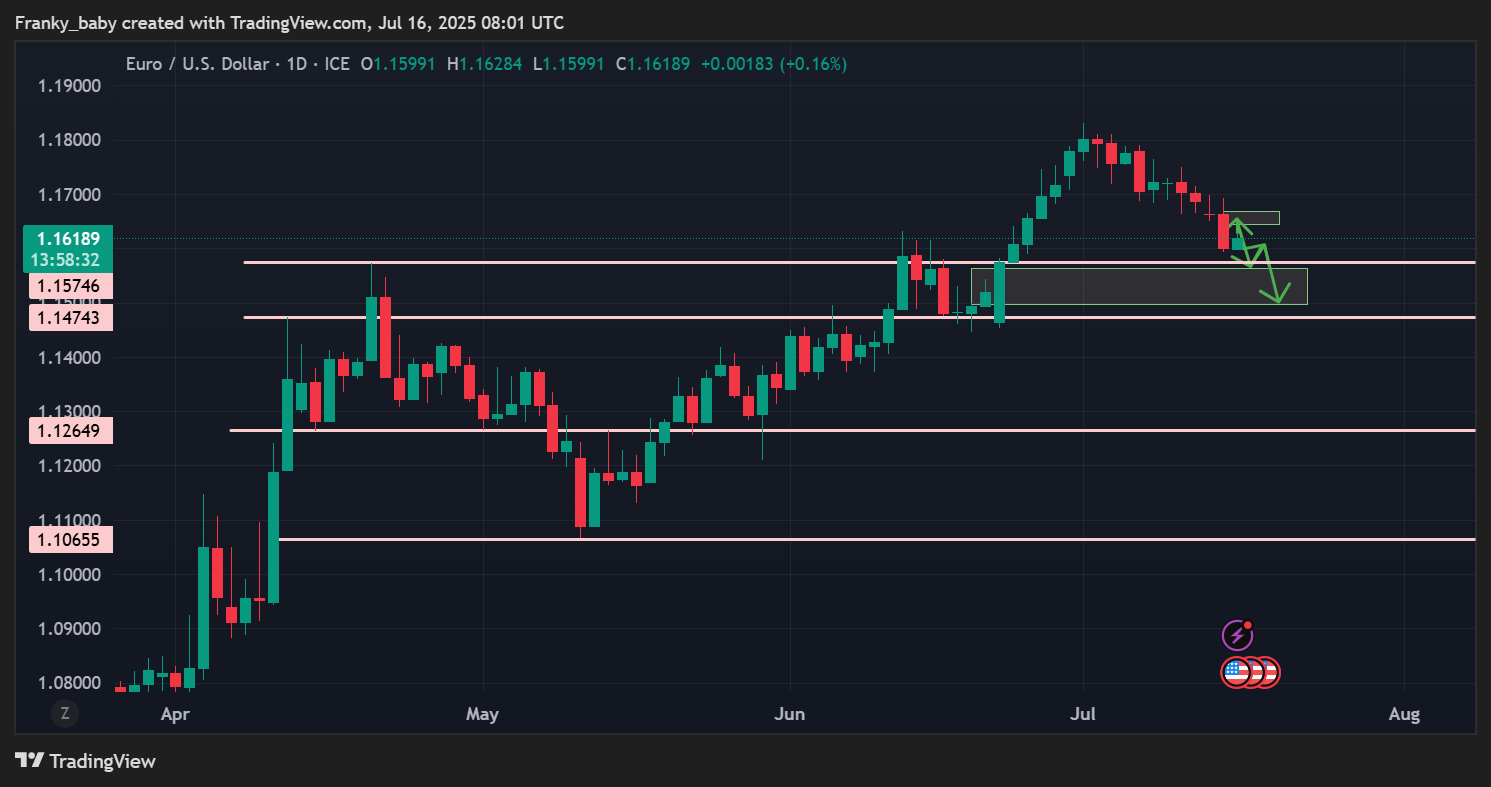
The above is actually just a copy of the following chart
now that you have seen it the power to gain knowledge is in your hands lets go back im hungry.

Thats its for this go look at this programming stuff we’ll be doing more of it in the future, until next time
Stay groovy
— The Professor
Yow, if you enjoyed this chapter, why don’t you buy me a coffee
in bitcoin of please, keep it hush hush ;)
1ACVTfAnWDjZYaYzxMVFAby9uuMzobV5gC